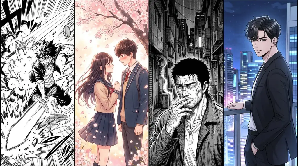
Understanding manga art styles is the fastest way to make your story feel authentic. Whether you're drawing by hand or generating panels with AI, the wrong style breaks immersion instantly. This guide breaks down the four styles creators ask about most — shonen, shojo, seinen, and manhwa — so you can match visuals to story intent from page one.
What Defines Manga Art Styles?
Manga art styles are defined by line weight, eye shape, body proportions, panel pacing, and emotional register. Each style evolved alongside its target audience, so the visuals carry genre signals readers recognize subconsciously. Getting those signals right is what makes a page feel intentional rather than accidental.
Manga is not one look. It's a family of visual languages. The confusion starts because Western readers often lump everything together as "anime art styles." But a Berserk page and a Sailor Moon page share almost nothing visually — they just both come from Japan.
Here's the core framework:
- Line weight — shonen uses bold, confident strokes; shojo uses thin, flowing lines
- Eye design — the single biggest style signal across all four categories
- Body proportions — realistic vs. stylized vs. elongated
- Panel density — how many panels per page and how much white space
- Toning and texture — screentone patterns, hatching, or flat color
Once you internalize these levers, you can describe a style to an AI tool — or to a collaborator — with precision.
Shonen Art Style: Bold, Kinetic, Built for Action
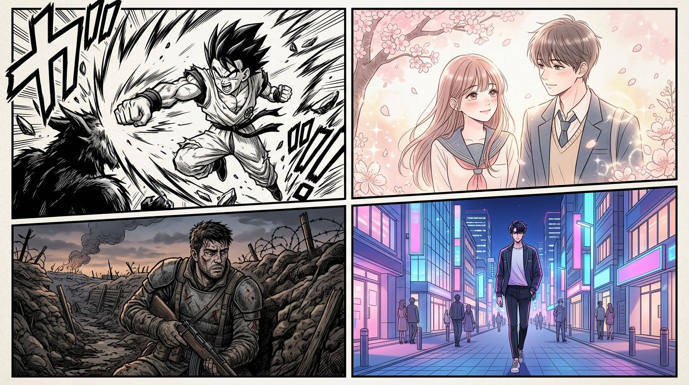
The shonen art style uses thick outlines, exaggerated motion lines, and high-contrast black fills to communicate speed and impact. Characters have strong jaw lines, spiky or dynamic hair, and eyes that read clearly at small sizes. The style prioritizes readability during fast action sequences over fine detail.
Think Naruto, Dragon Ball, My Hero Academia. The visual grammar is built for fight scenes and power-ups.
Key visual traits
- Thick, confident outlines — no hesitation in the stroke
- Speed lines and impact frames — motion is always implied, even in still panels
- High contrast — large black fills next to clean white areas
- Expressive but simple eyes — big irises, but not as elaborate as shojo
- Muscular or athletic builds — even younger characters look capable
- Panel layout — dynamic, diagonal cuts, overlapping panels during climaxes
Worked example: a fight scene panel list
Suppose your scene is: Kai charges at the rival, breaks through a wall, and lands a punch.
In shonen style, you'd script it as:
- Panel 1 — Low angle, Kai's foot pushing off the ground, speed lines radiating outward
- Panel 2 — Full bleed close-up of his fist, impact lines, screentone burst
- Panel 3 — Wide shot of the wall crumbling, debris mid-air, rival's shocked face
- Panel 4 — Tight on the punch landing, thick black impact star, no background
The style demands that every panel earns its space through energy.
Where shonen style breaks down
The failure case: shonen style applied to a slow, introspective story. Heavy outlines and speed lines on a quiet conversation scene feel tonally wrong. Readers expect action that never comes. The style creates a promise the story doesn't keep.
Shojo Art Style: Delicate Lines, Emotional Depth
The shojo art style is built around emotional interiority. It uses thin, flowing linework, elaborate eye designs with multiple highlight spots, and decorative backgrounds — flowers, sparkles, abstract patterns — that externalize a character's feelings. Proportions are elongated and graceful rather than athletic.
Think Sailor Moon, Fruits Basket, Cardcaptor Sakura. The page is a mood board as much as a narrative device.
Key visual traits
- Thin, varied linework — lines taper and swell expressively
- Elaborate eyes — multiple catchlights, detailed iris patterns, long lashes
- Decorative backgrounds — roses, cherry blossoms, screentone gradients
- Elongated proportions — long necks, slim limbs, graceful hands
- White space as emotion — negative space signals vulnerability or longing
- Panel layout — softer, rounder panel borders; irregular shapes; overlapping character portraits
Shojo style is harder to fake with AI than shonen. The decorative elements need to feel intentional, not random. If you're prompting an AI tool, specify "shojo manga style, thin linework, elaborate eye highlights, floral background elements" rather than just "manga."
Seinen Manga Style: Realism, Texture, Moral Complexity
Seinen manga style skews toward realistic proportions, detailed environments, and heavy texture work — crosshatching, dense screentone, and careful rendering of fabric and architecture. It handles moral ambiguity visually by avoiding the clean hero/villain contrast of shonen. Faces show age and fatigue. Backgrounds are as detailed as characters.
Think Berserk, Vagabond, Vinland Saga. The craft level is typically higher, and the visual storytelling is more cinematic.
Key visual traits
- Realistic anatomy — no exaggerated proportions unless intentional
- Heavy texture — crosshatching, dense screentone, ink wash effects
- Detailed environments — architecture, foliage, and props get full rendering
- Restrained eye design — smaller, more realistic eyes compared to shonen/shojo
- Cinematic panel framing — wide establishing shots, Dutch angles, close-ups on hands or objects
- Slower pacing — more panels per sequence, more silence between action beats
Seinen style is where AI tools currently struggle most. Generating consistent crosshatching texture across multiple panels is an unsolved problem. You'll often get flat shading where you need dense ink work. Workaround: generate clean line art and apply texture overlays in post.
Manhwa Style: Vertical, Colorful, and Built for Screens
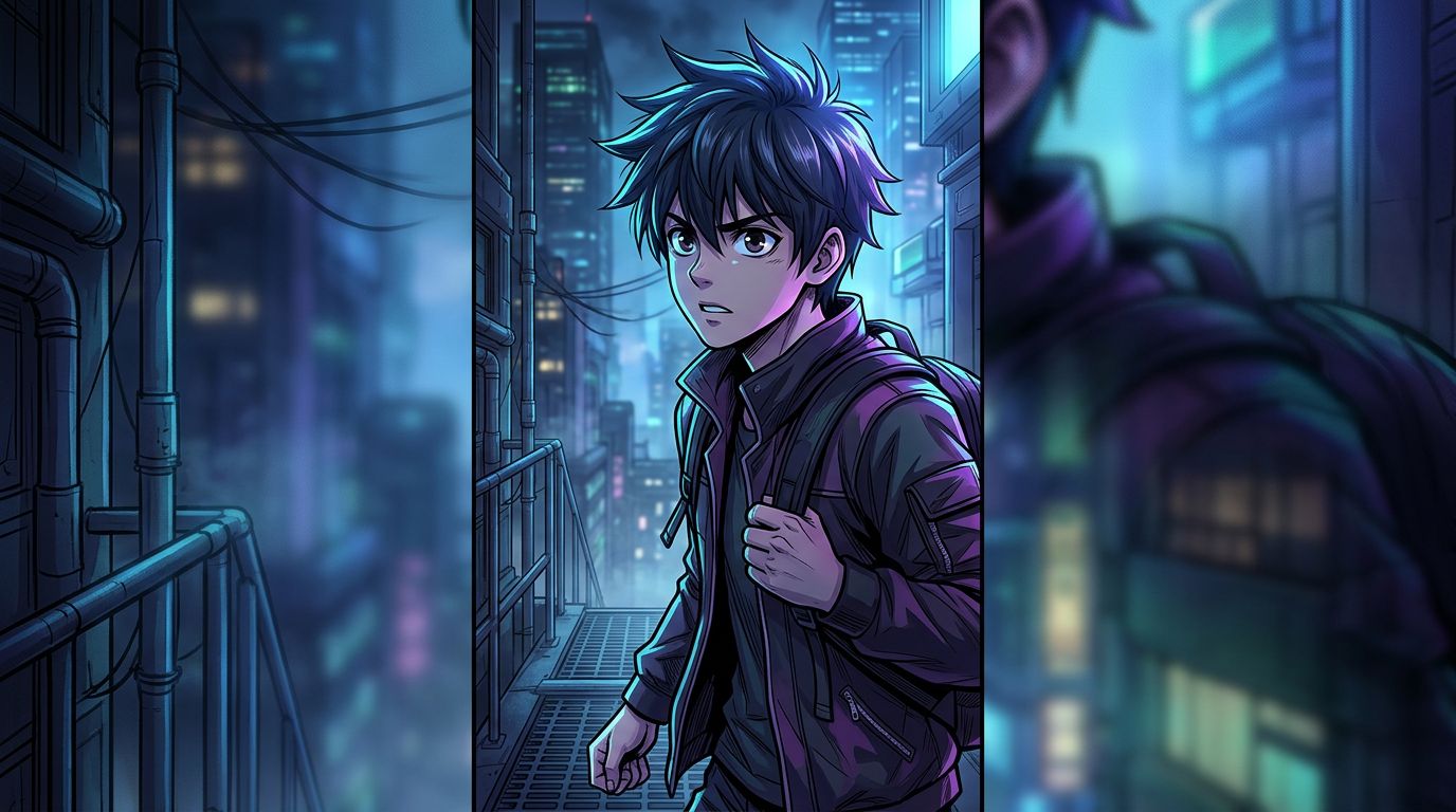
Manhwa style — originating from South Korea — is designed for vertical scroll on mobile screens. It uses full color instead of black-and-white screentone, clean digital linework, and cinematic color grading. Character designs often blend anime art styles with a softer, more polished aesthetic. Panels are taller than wide, optimized for the webtoon format.
Think Solo Leveling, Tower of God, True Beauty. The format and the style are inseparable.
Key visual traits
- Full color — not spot color, but fully rendered digital painting
- Clean digital lines — less variation in line weight than traditional manga
- Cinematic color grading — dramatic lighting, atmospheric color shifts
- Elongated vertical panels — designed for scroll, not page turns
- Character designs — large eyes, but softer and more rounded than shonen; skin rendering is detailed
- Emotional beats — wide panels used for reaction shots, similar to shojo but in color
If you're building a webtoon, manhwa style is the default expectation. Readers scrolling on mobile will immediately notice if your panels are formatted for print. Check out Manga vs Webtoon vs Comic: Formats, Reading Flow, and Which to Choose for a deeper breakdown of format decisions.
How to Apply These Styles When Using an AI Manga Generator
Choosing the right manga art style before you generate is more efficient than trying to correct style after the fact. Lock your style choice in your character and scene descriptions, use genre-specific visual vocabulary in your prompts, and keep a reference panel as your style anchor across all chapters.
Here's a practical workflow:
- Name the style explicitly — "shonen manga style" or "manhwa webtoon style" in every character prompt
- Specify the key traits — don't just say "manga"; say "thick outlines, speed lines, high contrast" for shonen
- Lock a reference panel — generate one panel you're happy with, save it, and use it as a consistency anchor
- Separate style from content — describe the scene action separately from the style instructions
- Regenerate selectively — if one panel's style drifts, regenerate that panel alone without touching the rest
If you're converting an existing story into panels, Text to Manga: How AI Manga Makers Turn Your Story Into Pages covers how to map prose descriptions to style-specific visual prompts.
For creators starting from scratch with no drawing background, How to Make Manga Without Drawing Skills (2026 Workflow) walks through the full production pipeline.
FAQ
What is the main difference between shonen and shojo art styles?
Shonen uses thick outlines, bold contrast, and kinetic energy to support action stories. Shojo uses thin, delicate linework, elaborate eye designs, and decorative backgrounds to support emotional and romantic stories. The difference is not just aesthetic — it's a visual signal about the story's emotional register.
Can manhwa style and manga style be mixed?
Yes, but intentionally. Some creators use manga-style black-and-white linework with manhwa's vertical scroll format. The result feels hybrid and can work for certain genres. The risk is that readers have strong format expectations — manga readers expect page turns and grayscale; webtoon readers expect scroll and color. Mixing without a clear reason can feel unfinished.
Which manga art style is easiest to generate with AI tools?
Shonen is currently the most consistent for AI generation. Its bold outlines and high contrast are easier for models to reproduce reliably across multiple panels. Seinen is the hardest — dense crosshatching and realistic anatomy drift significantly between generations. Shojo and manhwa fall in between, with shojo's decorative elements requiring more specific prompting.
Start Generating in Your Style
You've got the visual vocabulary. Now put it to work. TabStory's AI manga generator lets you lock a style, build a consistent cast, and generate panel-by-panel from your story text — whether you're working in shonen, shojo, seinen, or manhwa. Paste your scene, pick your style, and see your first panel in under a minute.